Loading…
React / Full Stack
Design SystemComponent library and Storybook
Why a marketing site owns a component library A portfolio site does not need a design system to render. The reason to build one anyway is the same reason a client project deserves one: the moment more than one page shares a button, a colour decision or an animation curve, undocumented UI turns into debt […]
Storybook 9React 19Next.js 16Tailwind CSS 4TypeScriptVite
10
documented UI primitives
100%
stories with automated a11y checks
1
source of truth — docs import production data
Why a marketing site owns a component library
A portfolio site does not need a design system to render. The reason to build one anyway is the same reason a client project deserves one: the moment more than one page shares a button, a colour decision or an animation curve, undocumented UI turns into debt someone pays later. This library is small on purpose — ten primitives, from Button to a scroll-snap Carousel — but it is run with the rigour I would apply to a fifty-component product system, and it is the system this site is actually built from.
Decisions live where they’re read
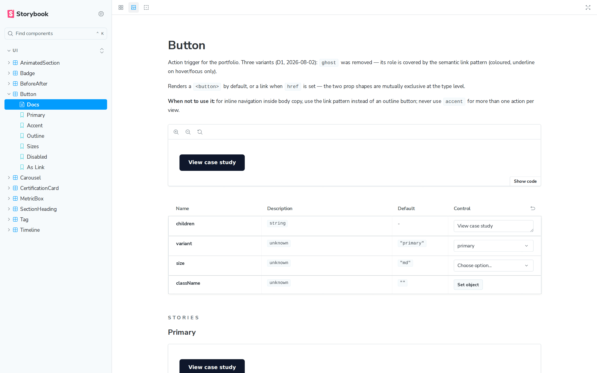
Every story opens with the design decision it encodes, not with a bare prop table. Button documents why the ghost variant was removed and its role handed to the semantic link pattern. Badge documents that its variants map one-to-one onto the WordPress project_type taxonomy, so the CMS drives each card’s colour with no translation glue. Tag is documented as what it is — a readable alias of the same chip geometry, kept because call sites read better, not because it is a second chip. When a decision changes, the story is the changelog.
Tokens before colours
The components speak a semantic layer — ink, surface, line, accent — rather than raw palette names. That layer is what turned this site’s rebrand into a token edit instead of a find-and-replace across twenty-odd files, and it keeps the documentation honest: Storybook loads the production stylesheet, so a token changed in the app changes in the docs the same second.
Docs that cannot drift
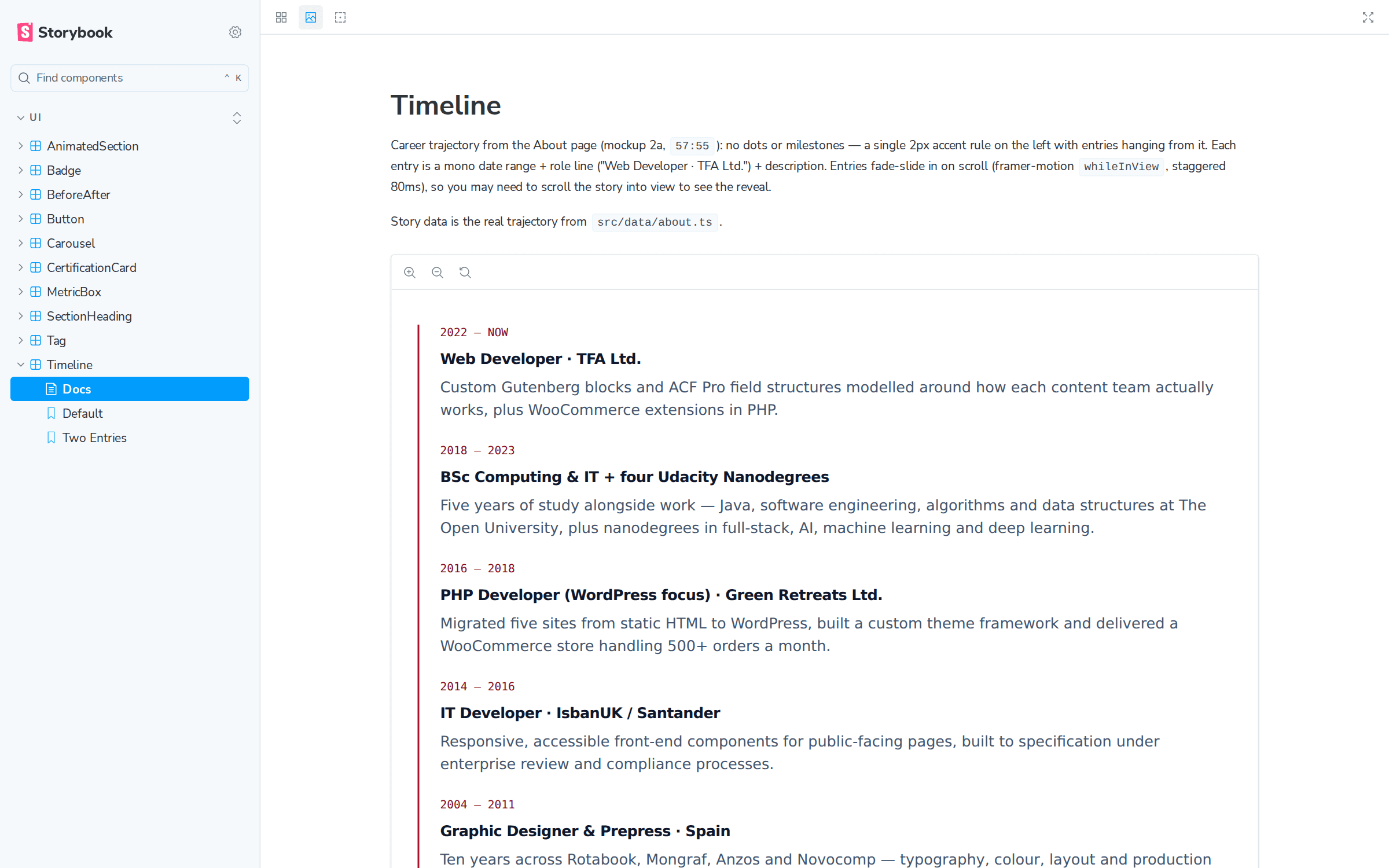
Storybook runs on Vite, deliberately decoupled from the Next.js runtime — the one Next dependency in scope is aliased to a plain-anchor mock, so a framework upgrade cannot break the documentation. Typography is the same idea in reverse: the app loads its fonts through next/font CSS variables, and the Storybook preview defines identical variables, so type resolves the same in both. The content is real too: the Timeline and CertificationCard stories import the production CV data from the same module the About page uses. No lorem ipsum, no fixture drift.
Accessibility as a working constraint
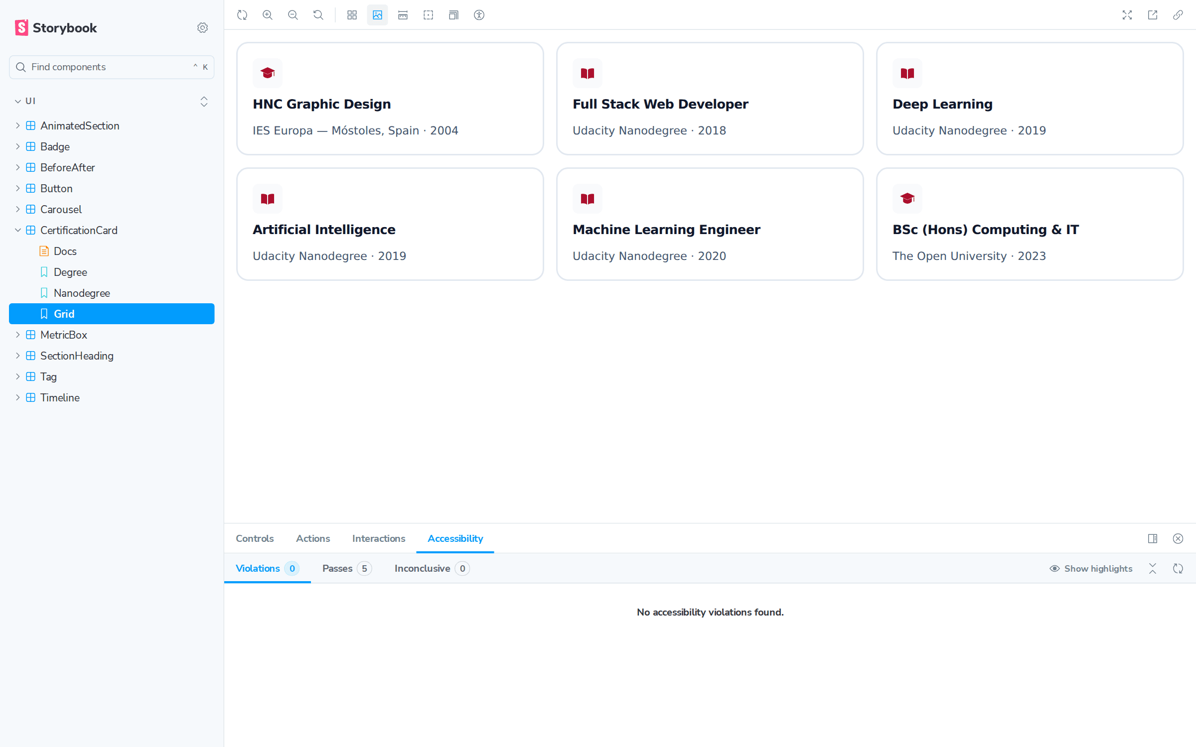
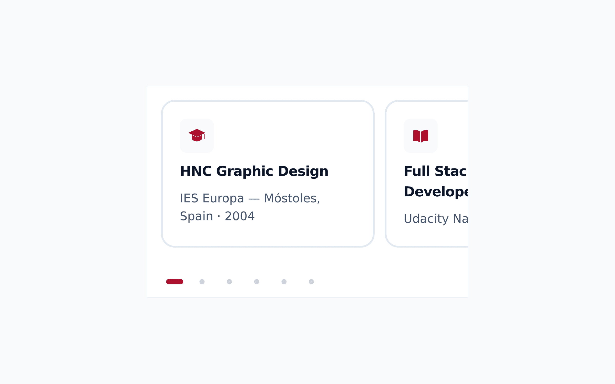
The a11y addon runs automated checks on every story, but the decisions worth naming are manual. The mobile carousel’s dots are real buttons on 32px touch targets with visible keyboard focus. Its active pill changes colour on dark surfaces, because the accent on slate-900 measures 2.6:1 — below any acceptable contrast floor. The reveal animations sit behind a prefers-reduced-motion safety net. Automated tooling flags none of this; it has to be designed in.
What you can verify
- Open any component’s docs page — the design decision, and when not to use the component, are written at the top.
- Tab through the Carousel story — the dots take keyboard focus and announce their position.
- Toggle the accessibility panel on any story and read the automated checks.
- Compare a component here with the live site — same tokens, same fonts, same data, because they are the same source.
What this transfers to a client build
The size of the system is not the point; the discipline is. Tokens before colours, decisions documented next to the components they shape, accessibility treated as a constraint rather than a checkbox, and documentation wired so it cannot quietly rot. That approach drops into a WooCommerce storefront or an editorial design system unchanged — the only thing that scales up is the component count.
Tech Stack & Links
Storybook 9React 19Next.js 16Tailwind CSS 4TypeScriptVite